yahoo financeから株価データを入手して、チャートを描画した作業メモです。
株価データの取得
ライブラリをインポートします。
import os
import pandas as pd
import sys
from yahoo_finance_api2 import share
from yahoo_finance_api2.exceptions import YahooFinanceError
株価データを取得してDataFrameに成形する関数を定義します。
def get_data(name, year_num):
    my_share = share.Share(name)
    symbol_data = None

    try:
        symbol_data = my_share.get_historical(
            share.PERIOD_TYPE_YEAR,
            year_num,
            share.FREQUENCY_TYPE_DAY,
            1)
    except YahooFinanceError as e:
        print(e.message)
        sys.exit(1)

    # DataFrameに変換
    df_symbol_data = pd.DataFrame(symbol_data)

    # UNIX時間をUTC時間に変換
    df_symbol_data.timestamp = pd.to_datetime(df_symbol_data.timestamp, unit='ms').dt.strftime('%Y-%m-%d')
    df_symbol_data.timestamp = pd.to_datetime(df_symbol_data.timestamp)
    df_symbol_data = df_symbol_data.set_index('timestamp')

    return df_symbol_data
ダウ平均株価を1年分取得する場合。
df_d = get_data(name='%5EDJI', year_num=1)
df_d
open high low close volume
timestamp
2021-11-05 36268.750000 36484.750000 36190.199219 36327.949219 344600000
2021-11-08 36416.460938 36565.730469 36334.421875 36432.218750 284400000
2021-11-09 36404.531250 36416.980469 36173.070312 36319.980469 258020000
2021-11-10 36299.250000 36346.609375 36009.500000 36079.941406 278390000
2021-11-11 36038.781250 36108.171875 35915.269531 35921.230469 270320000
... ... ... ... ... ...
2022-10-31 32754.269531 32883.859375 32586.929688 32732.949219 390890000
2022-11-01 32862.789062 32975.480469 32485.230469 32653.199219 323210000
2022-11-02 32576.279297 33071.929688 32139.769531 32147.759766 398430000
2022-11-03 31985.050781 32185.710938 31727.050781 32001.250000 354440000
2022-11-04 32265.009766 32611.519531 31938.919922 32403.220703 422370000
252 rows × 5 columns日経平均株価を1年分取得する場合。
df_n = get_data(name='%5EN225', year_num=1)
df_n
open high low close volume
timestamp
2021-11-05 29840.730469 29840.730469 29504.070312 29611.570312 73500000
2021-11-08 29735.449219 29735.449219 29507.050781 29507.050781 68300000
2021-11-09 29557.550781 29750.460938 29240.310547 29285.460938 65000000
2021-11-10 29209.060547 29296.880859 29079.769531 29106.779297 63900000
2021-11-11 29046.189453 29336.029297 29040.080078 29277.859375 60600000
... ... ... ... ... ...
2022-10-28 27097.380859 27265.460938 26981.080078 27105.199219 144600000
2022-10-31 27404.300781 27602.990234 27392.990234 27587.460938 71100000
2022-11-01 27614.640625 27682.970703 27526.179688 27678.919922 72600000
2022-11-02 27562.300781 27692.550781 27546.880859 27663.390625 86600000
2022-11-04 27371.890625 27389.300781 27032.019531 27199.740234 111100000
244 rows × 5 columnsチャートの描画
mplfinanceライブラリを使用します。
まずは、日経平均株価のDataFrameの上から30個分を描画します。描画スタイルの変更は以下を参照。
mplfinance/examples/styles.ipynb at master · matplotlib/mplfinance
Financial Markets Data Visualization using Matplotlib - matplotlib/mplfinance
github.com
import mplfinance as mpf
# 30日分を描画
mpf.plot(df_n.iloc[0:30,:],type='candle',style='charles')
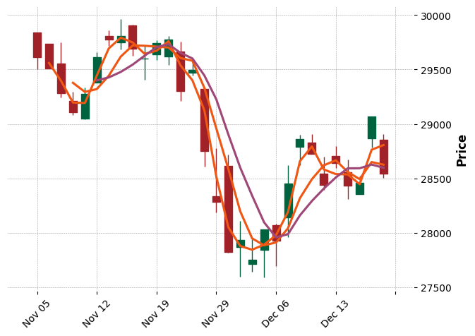
# 移動平均線も描画
mpf.plot(df_n.iloc[0:30,:],type='candle',mav=(2,4,6),style='charles')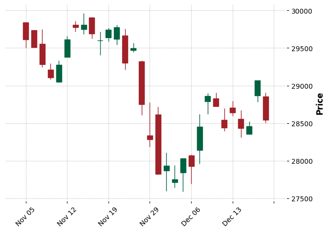
複数のチャートをサブプロットに描画する。詳細は以下を参照。
mplfinance/examples/external_axes.ipynb at master · matplotlib/mplfinance
Financial Markets Data Visualization using Matplotlib - matplotlib/mplfinance
github.com
import matplotlib.pyplot as plt

fig, axes = plt.subplots(2, 1, figsize=(8,8))

# 日経平均株価を30日分描画
mpf.plot(df_n.iloc[0:30,:],ax=axes[0],type='candle',style='charles')
# ダウ平均株価を30日分描画
mpf.plot(df_d.iloc[0:30,:],ax=axes[1],type='candle',style='charles')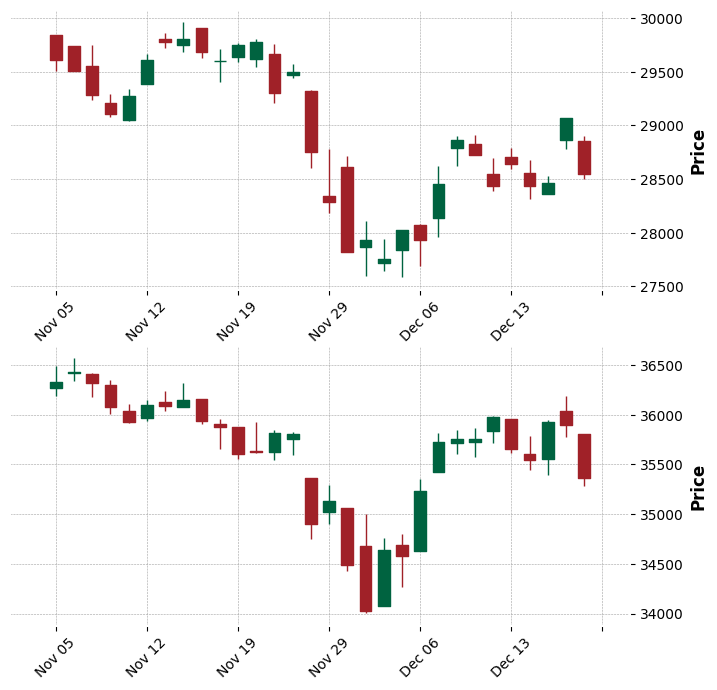
軸目盛等を削除して描画する。
fig, axes = plt.subplots(2, 1, figsize=(5.12,5.12))

mpf.plot(df_n.iloc[0:30,:],ax=axes[0],type='candle',style='charles')
mpf.plot(df_d.iloc[0:30,:],ax=axes[1],type='candle',style='charles')

axes[0].axis("off")
axes[1].axis("off")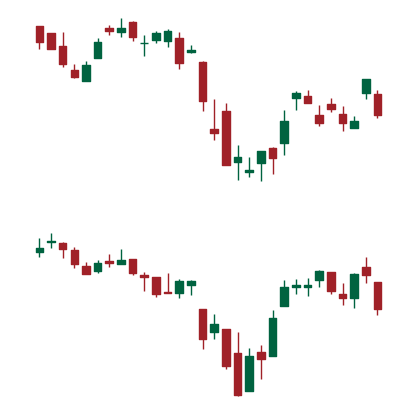
画像の保存・データセット作成
指定したインデックスから、-1~-31日の間のチャート画像を保存する関数の定義。
os.makedirs('./img', exist_ok=True)

def plot_chart(i, df_n, df_d):
    fig, axes = plt.subplots(2, 1, figsize=(5.12,5.12))
    mpf.plot(df_n.iloc[i-30:i,:],ax=axes[0],type='candle',style='charles')
    mpf.plot(df_d.iloc[i-30:i,:],ax=axes[1],type='candle',style='charles')

    axes[0].axis("off")
    axes[1].axis("off")

    name = str(df_n.index[i]).replace(' 00:00:00','')

    fig.savefig(f'./img/{name}.png')
そのほかの処理。
# ダミー変数を作成
df_n['dummy_n']=0
df_d['dummy_d']=0

# お互いの欠損日を把握するため、結合する
df_n = pd.concat([df_n,df_d['dummy_d']], axis=1).sort_index()
df_d = pd.concat([df_d,df_n['dummy_n']], axis=1).sort_index()

# 始値と終値の差を計算
df_n['delta']=df_n['close'] - df_n['open']

# ラベルを作成
df_n['label']=0
df_n.loc[df_n['delta']>100,'label']=1
df_n.loc[df_n['delta']<-100,'label']=2

# データセット化
import datasets
import json

data_li = []

for i in range(len(df_n))[30:]:
    if df_n.iloc[i].isnull().any():
        continue

    plot_chart(i,df_n,df_d)

    name = str(df_n.index[i]).replace(' 00:00:00','')
    delta = df_n.iloc[i]['delta']
    label = df_n.iloc[i]['label']

    tmp_dic = {
        'name':f'./img/{name}.png',
        'delta':delta,
        'label':label,
    }

    data_li.append(tmp_dic)

dic_json = {
    'version': '0.1.0',
    'data':data_li,
}

with open('dataset.json', 'w') as f:
    json.dump(dic_json, f, indent=4)
データセットの読み込み。
from datasets import load_dataset
dataset = load_dataset("json", data_files="dataset.json")

コメント